Typing on TV is broken. We rebuilt the keyboard and proved it.
We designed two on-screen keyboards for smart TVs. What started as a three-week college brief, ended as a 24-participant controlled study and a CHI Late-Breaking Work submission. The winning design cut typing effort by a fifth.
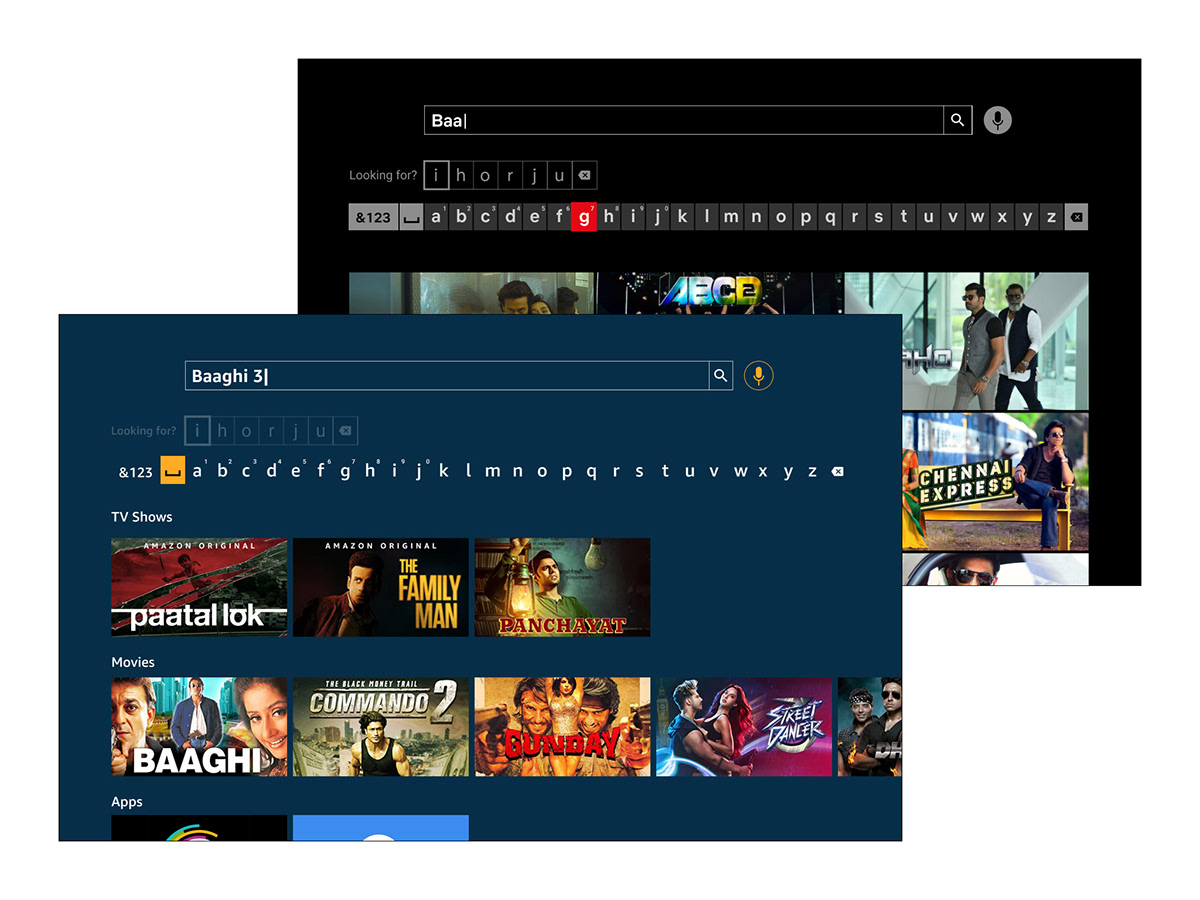
Everything about a TV got smarter except the way you talk to it.
TVs moved from channels to streaming, and that put search at the centre of the experience. The remote never changed: four directional buttons and a select key. We started with a hunch that this was painful. Then we spent the first days proving it wasn't just us.
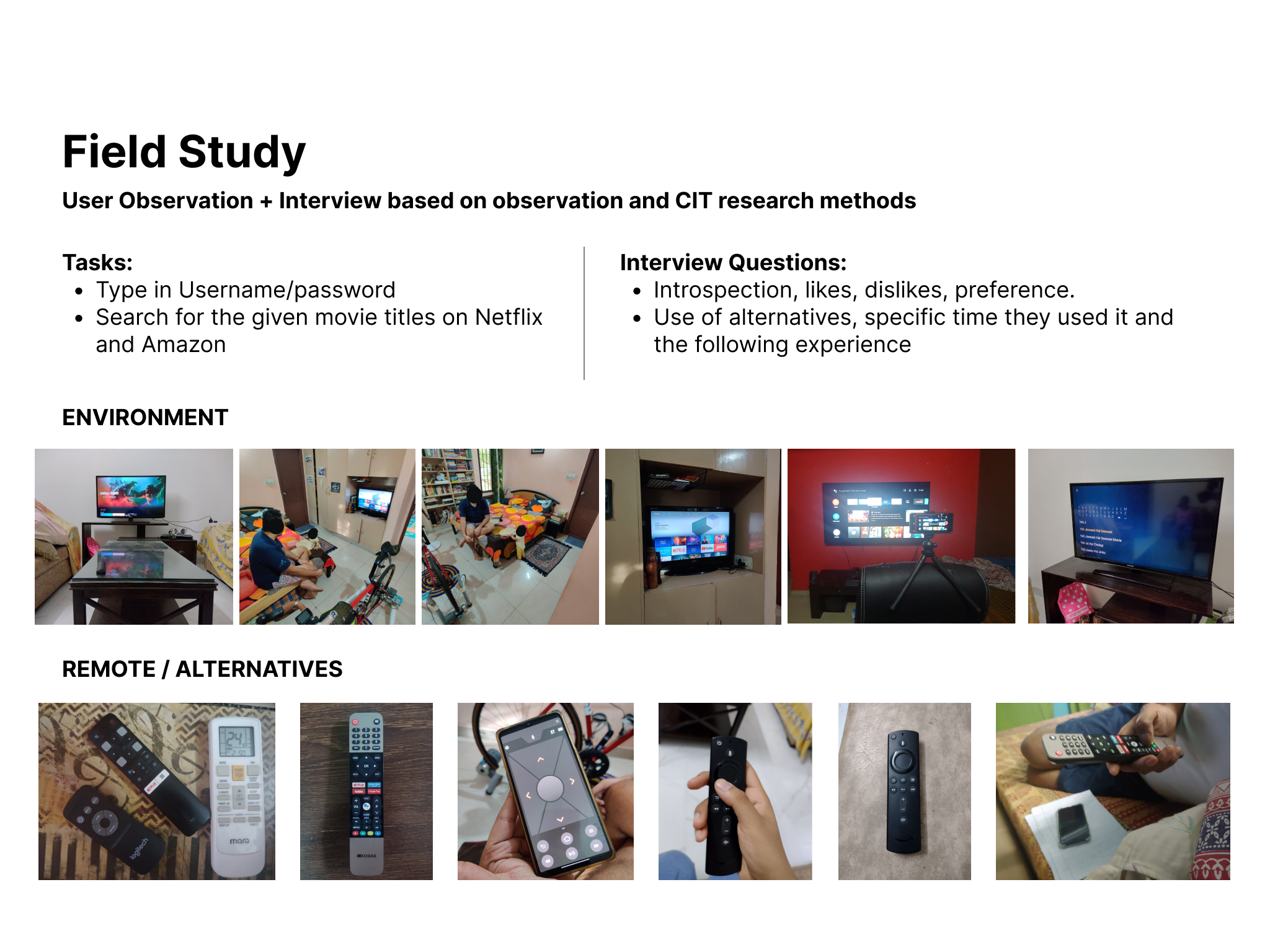
Three user groups, one shared frustration.
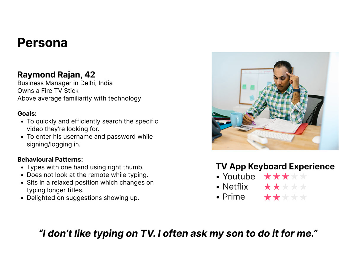
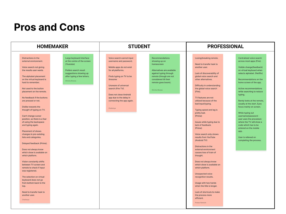
Empathy mapping split our observations into three groups: homemakers, students and working professionals. Professionals were the sharpest case. High familiarity with technology, high expectations, and the least patience for a slow interface. We designed for them.
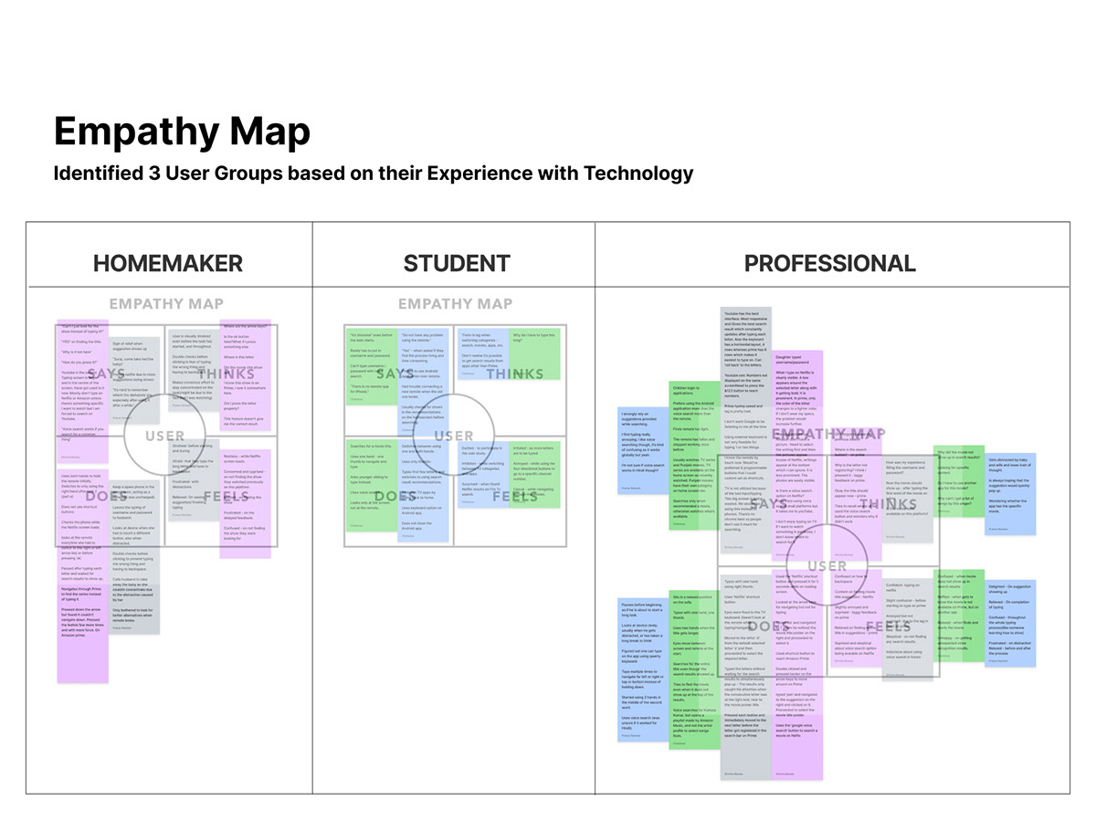
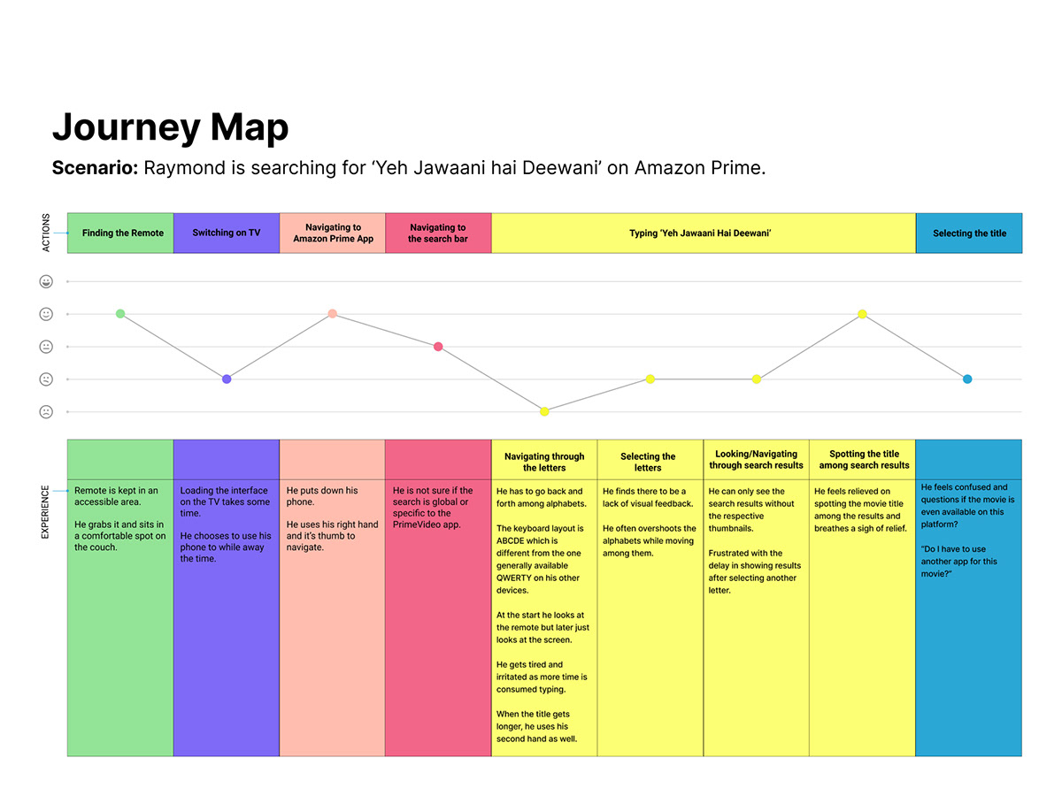
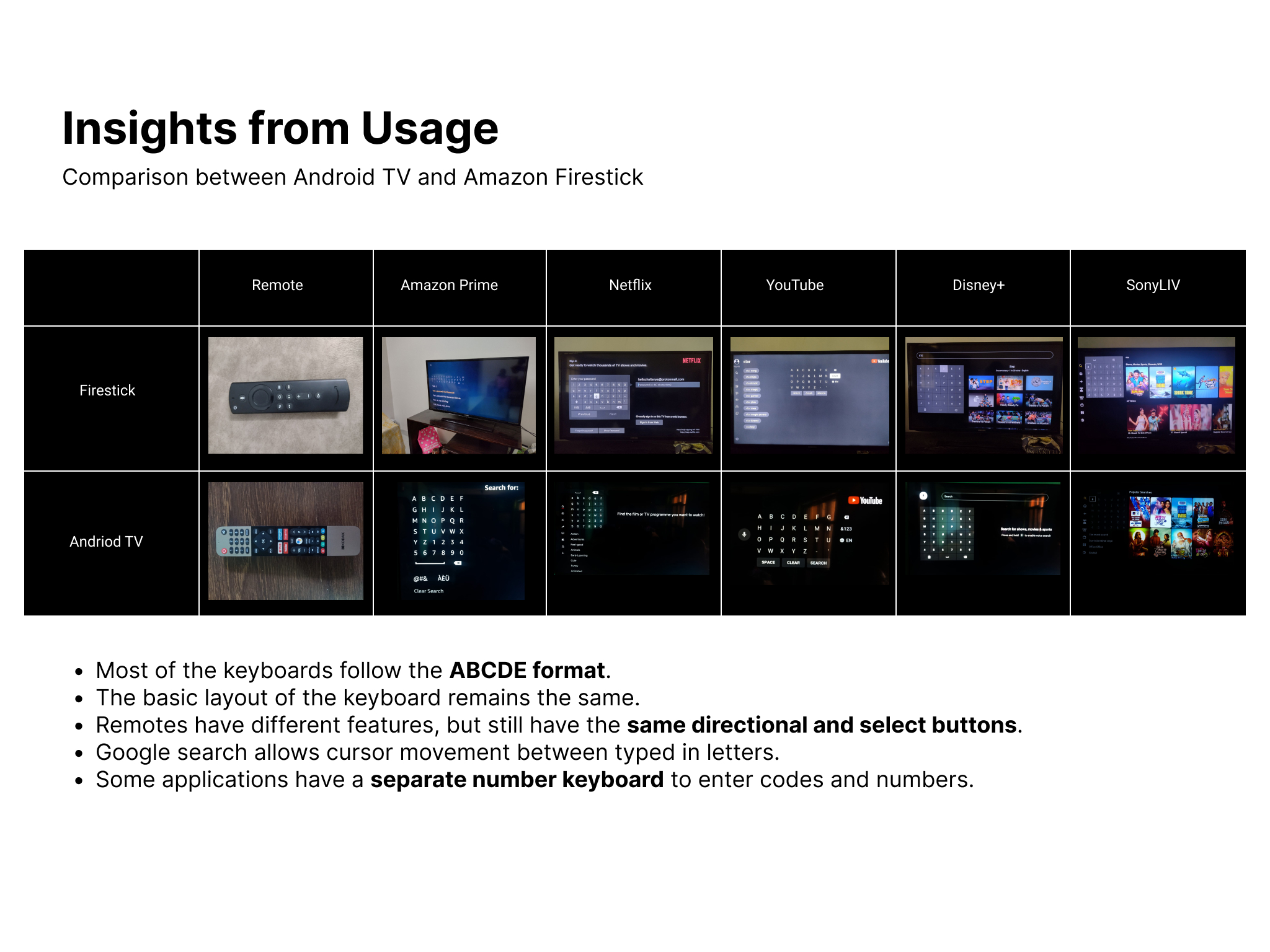
The pain isn't the typing. It's the travelling.
The survey, field notes and teardown gave us five insights. One of them reframed the whole project. People weren't complaining about entering letters. They were complaining about the distance between them.
Four opportunity areas
We explored the remote too, then chose to leave it alone.
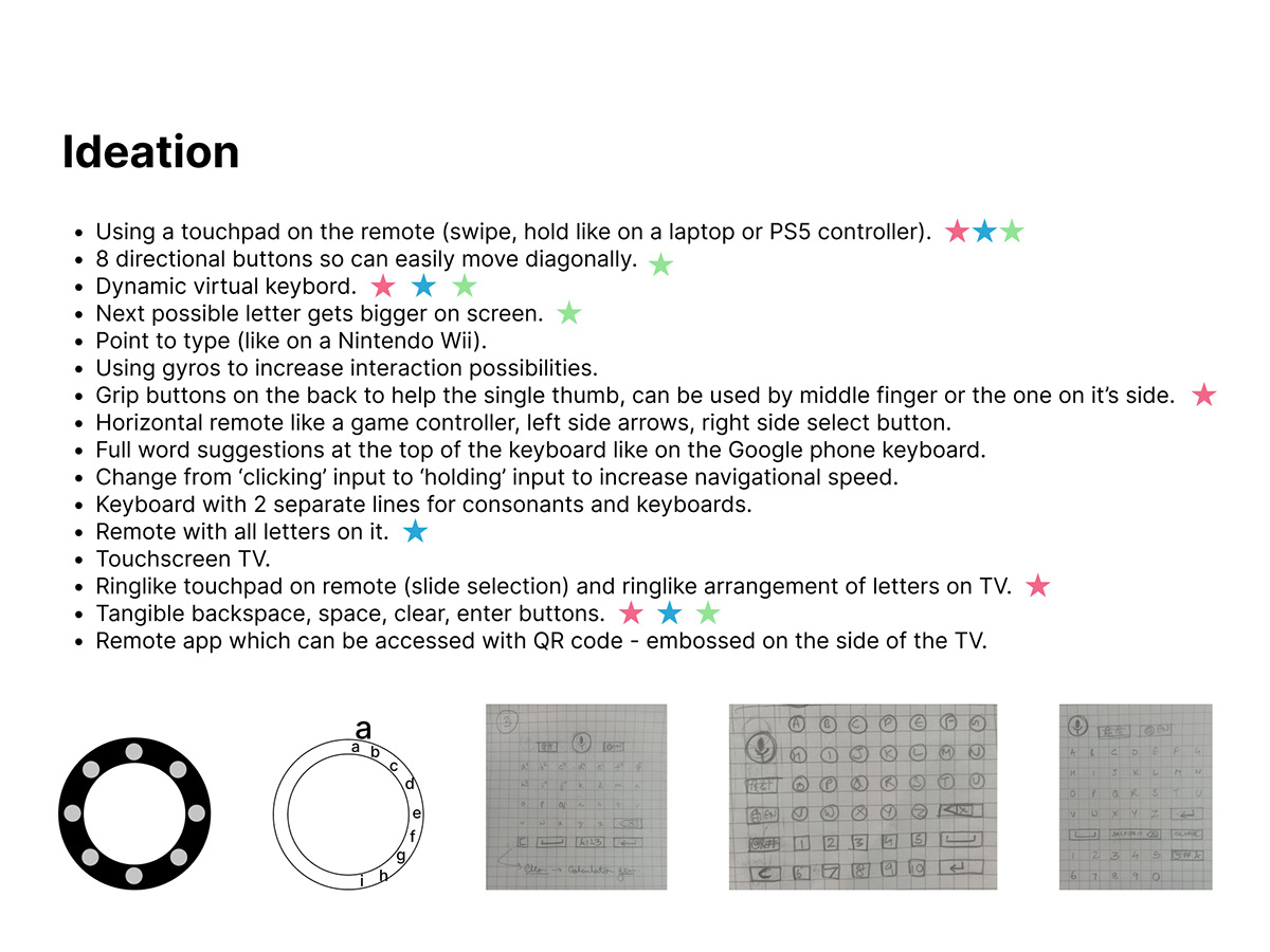
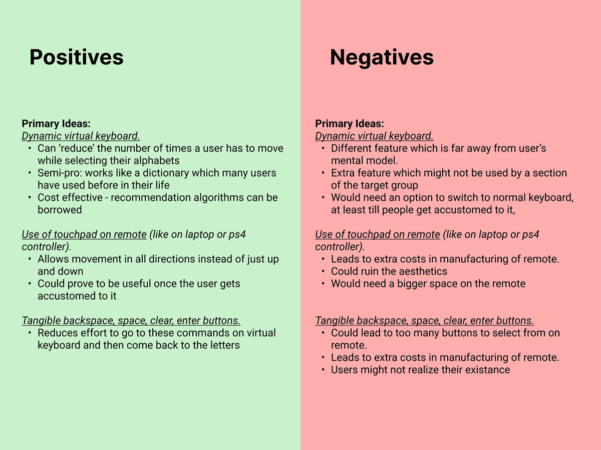
Our ideation ran wide. Touchpads on the remote, ring-like scroll wheels, grip buttons on the back, QR-launched phone apps, tangible shortcut keys. We scored every idea against all three user groups. The same objection kept winning: anything that changes the hardware adds cost, adds something to learn, and reaches nobody who already owns a TV.
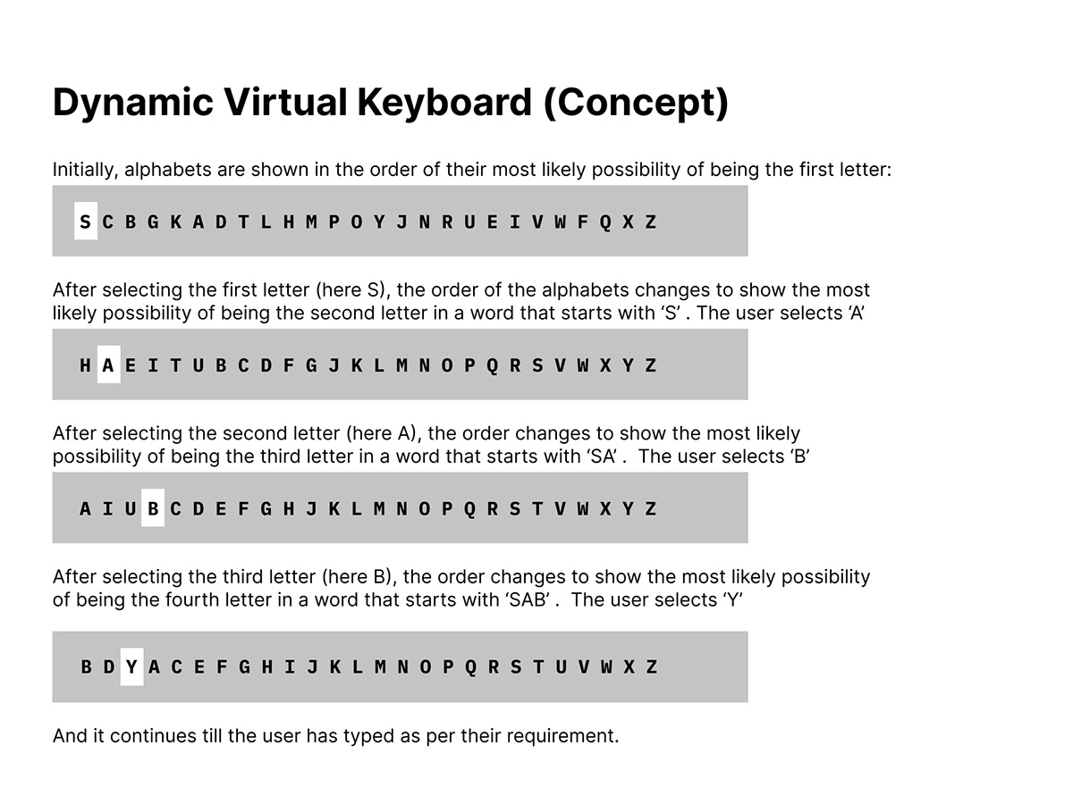
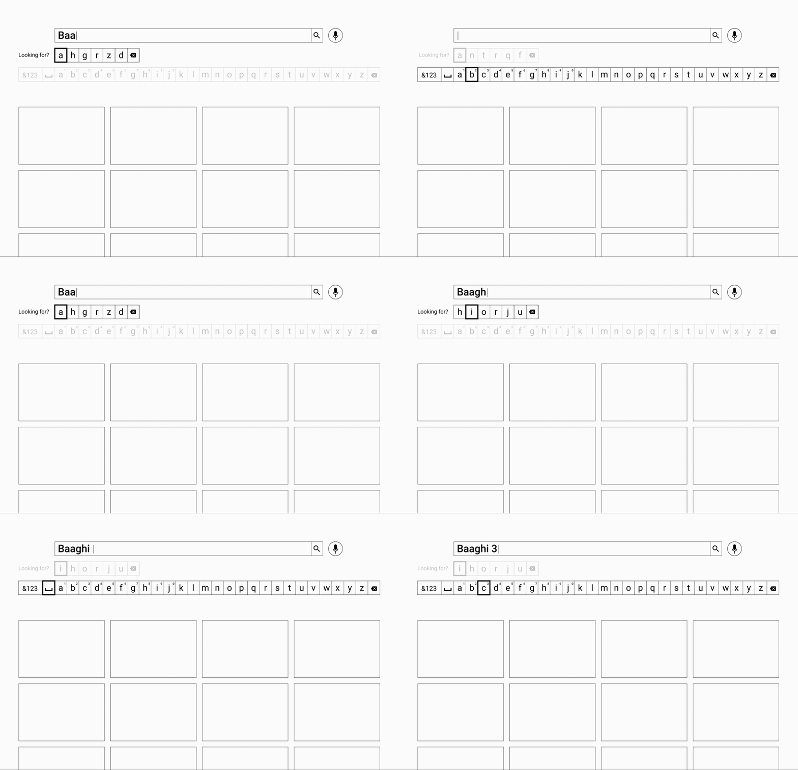
Two bets on the same problem, and a control to beat.
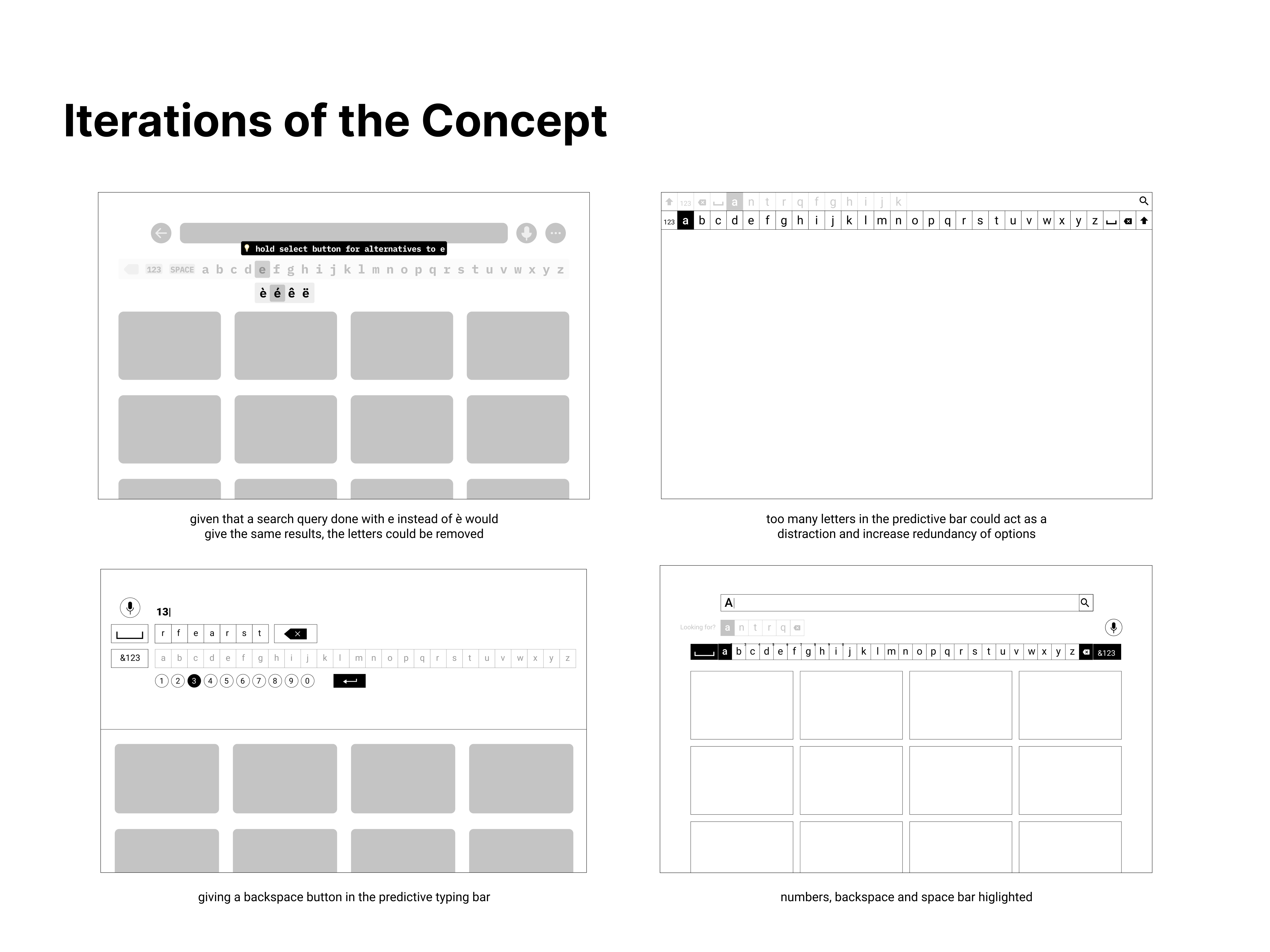
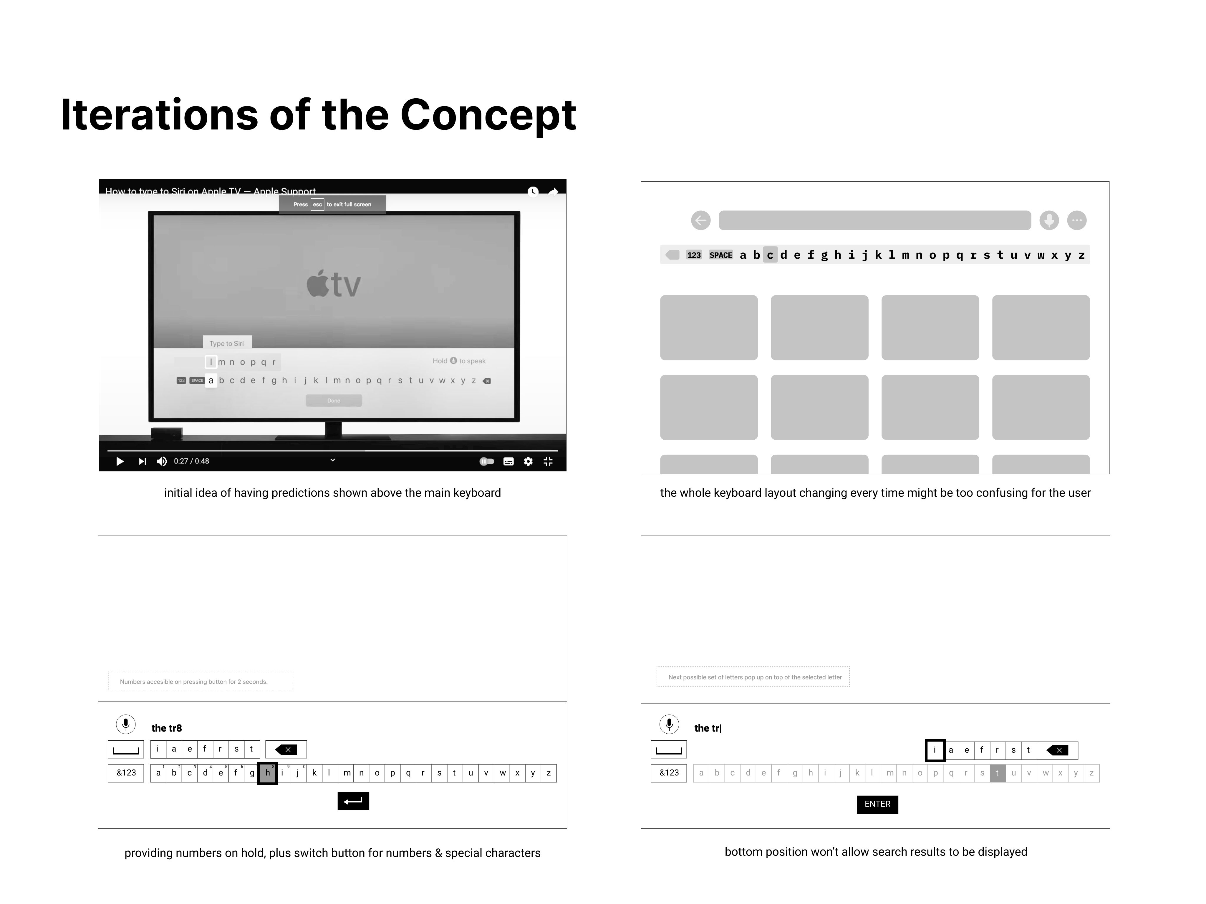
If navigating between characters is the cost, there are two ways to cut it: shorten the distance to the next character, or shorten the route to any character. The three-week brief produced the first answer. When we decided to take the work to CHI, we ideated a second time to test the other. Both then ran against the grid that streaming apps already ship.
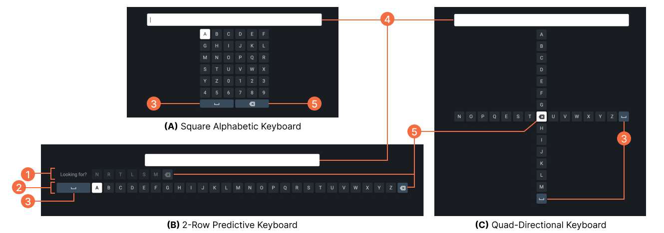
Working out the details
Layout was the easy part. State and feedback took the time. How a focused key reads from three metres away. Where the cursor lives. What a long-press does. How you reach numerals and symbols without a second keyboard. How backspace stays reachable from anywhere.
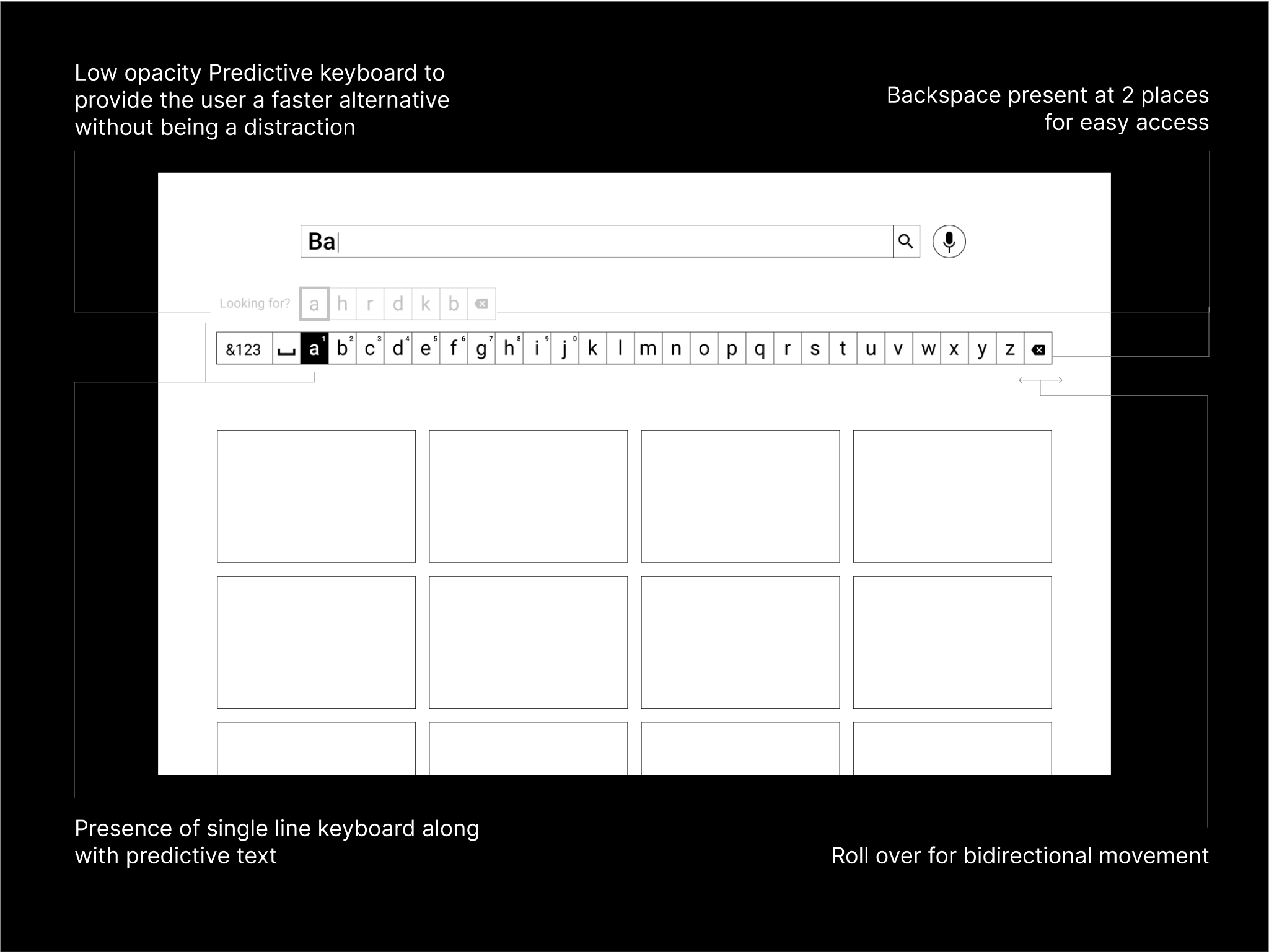
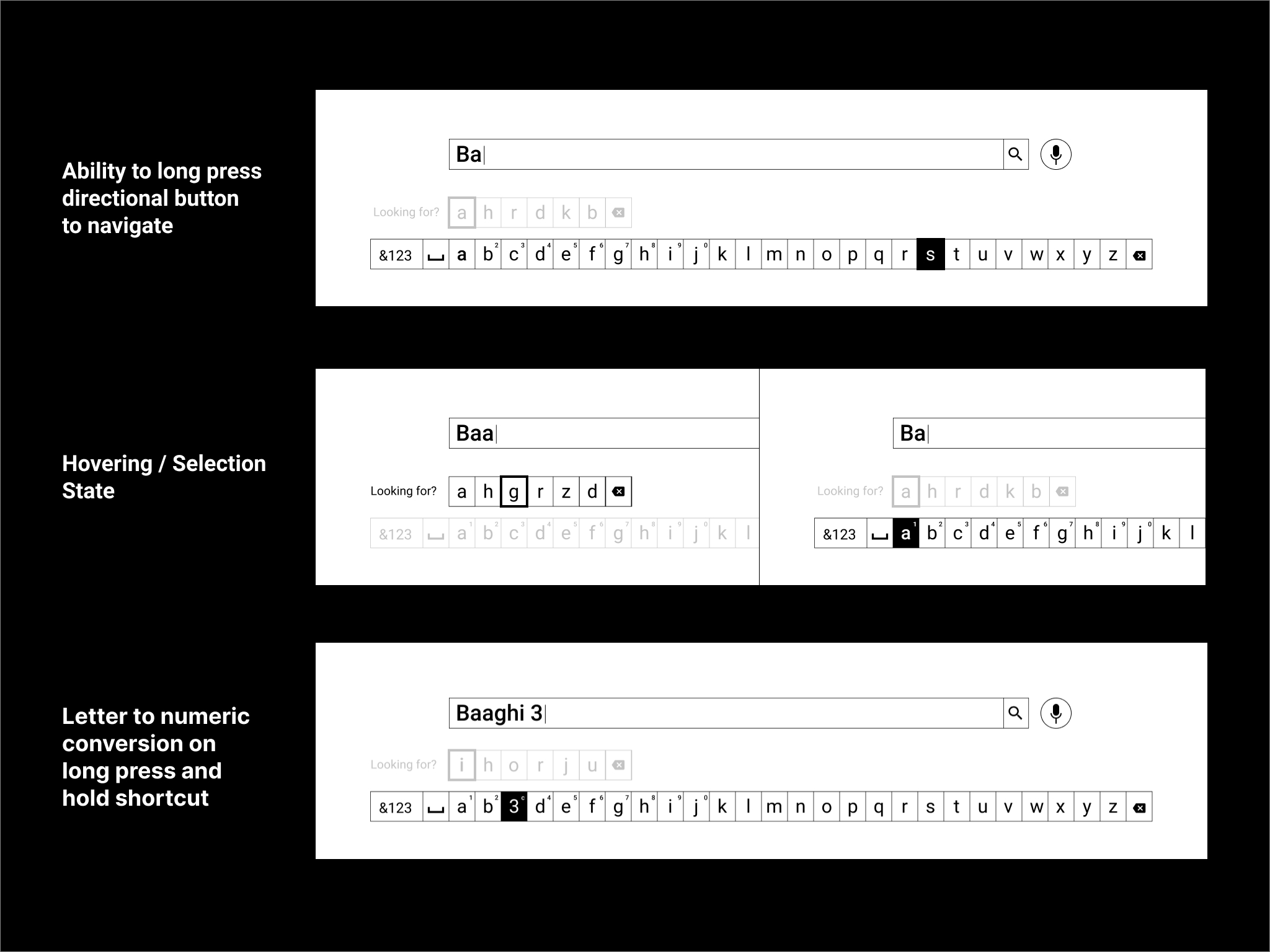
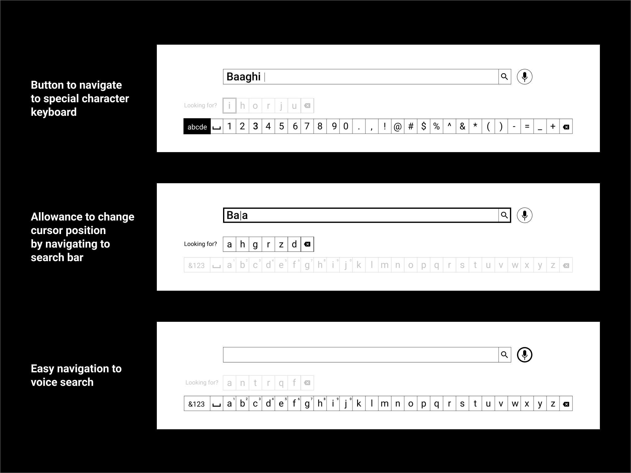
Type one title with four buttons.
This is a working rebuild of all three prototypes. You drive it the way the study drove it: four directions and a select key, nothing else. The move counter is the same measure I logged in the sessions. Type ‘THE WITCHER' on each layout and the difference stops being an argument.
The prototype is a faithful rebuild of the three tested keyboards, with a prediction model trained on a representative corpus of streaming titles.
A design opinion is worth nothing until it survives a study.
Our professor thought the concept was worth more than a course grade, so we built a study around it. I designed the protocol: what to measure, how to keep order effects out, and how to catch first impressions before familiarity wiped them.
Apparatus
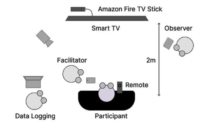
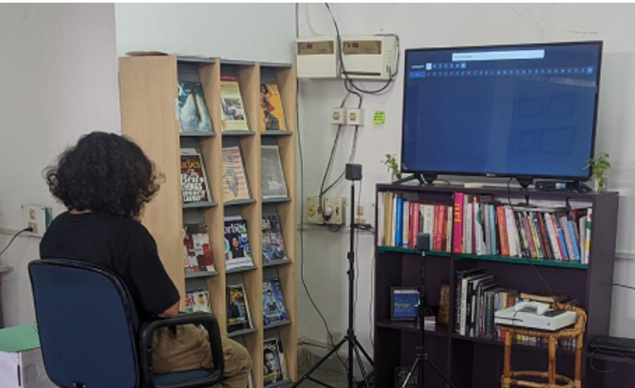
A 50″ 4K smart TV at 1.5 m height, with the participant seated 2 m away at eye level. Prototypes ran on the TV through Amazon's Web Tester on a Fire TV Stick, driven by the stock remote. Real hardware, real remote, real lean-back distance. We logged every button press, press time and resulting character off the device console, so the move counts are measured, not observed.
Two phases, on purpose
Phase one showed each keyboard cold, and recorded what people said before they touched it. That was deliberate. For an unfamiliar layout, the first reaction is a real usability signal, and it vanishes the moment someone learns the thing. It mattered here. The design people called “intimidating” on sight was the one they found easiest to pick up.
Phase two was the timed task, followed by SUS and a preference question. Keeping the two apart is what let us report the gap between what a design looks like and what it does.
One design won. The other failed usefully.
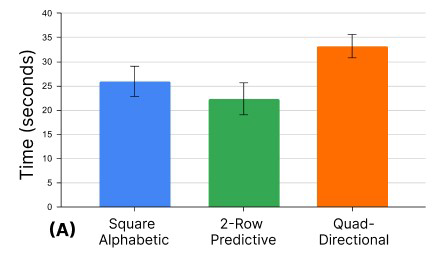
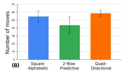
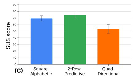
We ran a one-way ANOVA across all four measures, with pairwise comparisons. 2-Row Predictive beat the incumbent on effort and on satisfaction. Quad-Directional lost. It also told us exactly why, and that's the more interesting half of the finding.
Why the cross lost
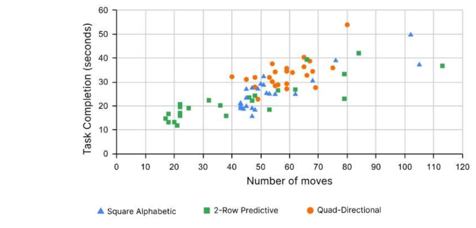
This is the pair of numbers I keep coming back to. Quad-Directional needed about the same number of moves as the grid, 58.7 against 54.75. It still took eight seconds longer. If the presses are equal and the time isn't, the cost isn't navigation. It's search. People simply could not find a letter in a “+”.
That killed the hypothesis, and sharpened the principle behind the winner. Text entry is a visual search followed by a motor action. A layout that optimises the second while wrecking the first comes out behind. The alphabetic row worked because it's linear and everyone already knows the order. The prediction row then shortens the trip without ever making you hunt.
What people said
Submitted to CHI 2023 as Late-Breaking Work.
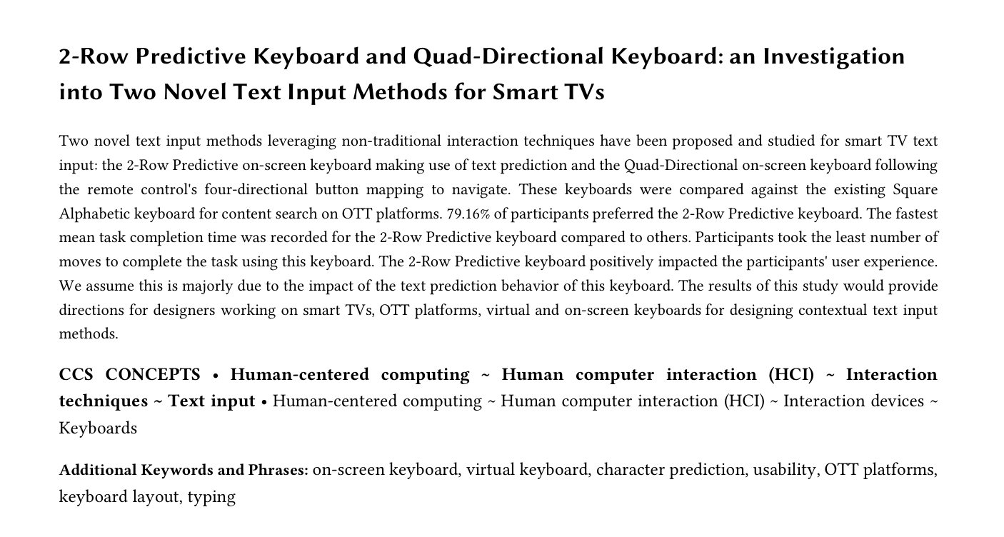
Our paper wasn’t accepted, but I learned a lot from the research process. The abstract below is the version we submitted. If you’d like to know more, drop me an email. Happy to chat!
The project taught me to hold a design opinion loosely and a measurement tightly. We were sure Quad-Directional was the clever one. It was the clever one. It also lost. The reason it lost, visual search costs more than motor movement, is worth more to me now than a win would have been.
It also taught me the value of instrumenting a prototype. Logging every button press off the device console is what turned “this feels faster” into a fifth fewer presses.
The constraint we set early, no new hardware, is the decision I'd make again. It's the reason the winning design could ship into an existing app tomorrow.
Happy to share more on this.
The study protocol, the full paper, or any of the design decisions behind it.